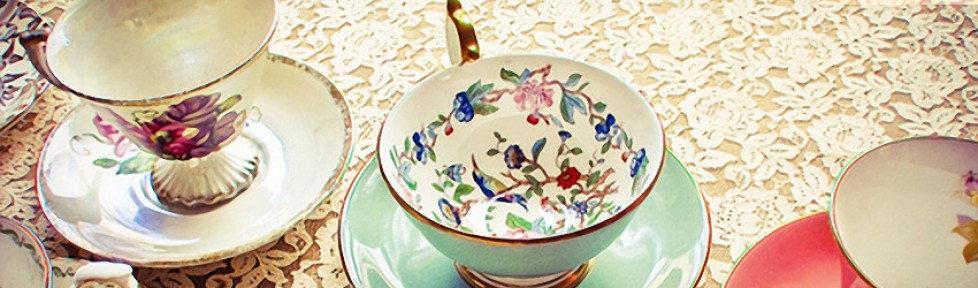
For my logo design, I wanted something that was simplistic but effective in conveying my topic. I also wanted something that tied into the design principles I used for my blog. As you can tell from looking at the photo I have at the top of my blog page, I really like fancy tea sets and cute teacups. Even though growing up I had never been very girly, I played with horses instead of dolls, and I preferred playing adventure to playing house, one thing I allowed myself to love was tea parties. I’ve always enjoyed getting dressed up in my best clothes, drinking tea, eating finger sandwiches, and talking to good friends. I feel that as a symbol, a teacup can convey a lot of ideas and emotions, at least for myself.
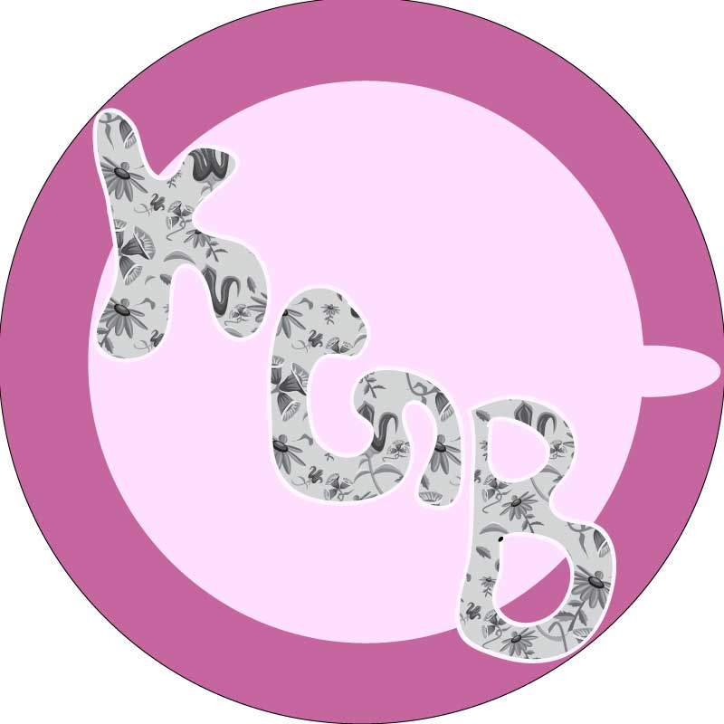
My logo has four basic elements that I think combine to form a complete design. The first two elements were simple circles that I used to represent the body of the teacup and the saucer on which it sits, I thought that the light pink of the cup, and the darker pink of saucer contrast well enough to be distinguishable from one another, but not so much that it is distracting. I created these two shapes using the ellipse tool. The third shape, another made by the ellipse tool, is the elongated nub that serves as the handle. The fourth and final element is the inscription: KGB, for Kara Grace Beseler. Being a fan of history, I have always loved my initials, how could anyone familiar with the cold war not? I may not always be fond of my first name, of how often people misspell or mispronounce it, but I would never change my initials. I love joking about them and seeing the blank stares people give me or even better is the silly grin a fellow history nerd may pass my way.
To research a few principles of design I looked at the following websites, though my basic approach was to keep the design as simplistic as possible while still being recognizable:
http://www.thelogofactory.com/logo-design-tips/
http://www.code-interactive.com/thinker/a112.html
http://sixrevisions.com/graphics-design/70-excellent-logo-design-tutorials-and-resources/

Hey Kara,
Great job on your logo design; I really like your back story and think your design itself is a great idea. I also really like the font lettering you chose as well. From what I can tell, it looks like you drew them yourself instead of picking on of the generic fonts that illustrator provides for you. I was a good way to show more of your artistic talents. Also the fill of the letters is really unique, the idea of your tea cup saucer is really cool and original and its cool you made that your logo because of the past experiences you had growing up with tea parties. However, one thing I think somehow you could improve is make it seem more like a tea cup because it took me a while to see what exactly what it was. Maybe outline the cup part would help it. Other than that I think your logo is really cool and look forward to seeing the final project.
I love your logo. I think it’s a great representation of you after reading the explanation! I agree with the above commenter that the lettering shows you did it yourself and your initials are really unique! KGB, I read it chuckled and then read what you wrote and was like that is awesome! I also love the print you put in your letters, it’s unique and I think it shows more about you. I really didn’t see the tea cup in the logo until I read your response, maybe try outlining it? Or create an angle? I don’t know what else to suggest with that. But I think you have a create story, idea and logo and I think your final product will be good!
As a draft, I’m quite proud of my little teacup design, but I can see that many of the flaws that my peers pointed out are well grounded. The main flaw being that the shape of the teacup is fairly hard to distinguish when the design is so minimal, and can only really be seen when it is pointed out. I’m definitely going to play around with it a lot more, but a few things I am considering are looking at it from another angle, instead of looking down at the teacup, I may try designing it from a side view angle. I really like the idea of looking down and seeing the cup and saucer though, so I may try to add a distinguishing outline to the shapes to help define them. I’m going to keep my initials as part of the design, and hopefully I’ll still be able to keep the same fill I have in them.
There are several aspects of your logo I really like. I like the color choices and how they coordinate with one another, the rich, almost royal purple color with the lilac is very attractive! I also like the circle shape of your logo, very creative! While I like the word/ letter KGB concept, I think the letters could be smaller. They take up a lot of space. Also I had trouble trying to identify the middle letter. I also suggest making the letters were more distinct, so people can easily identify the KGB. Overall, love the concept and touch of femininity to the logo, work on making the letters more identifiable and smaller.